Saturday 9 February 2013

Jamie's Evaluation

In what ways does your media product use, develop or challenge forms and conventions of real media products?

                                                                                    My Magazine!


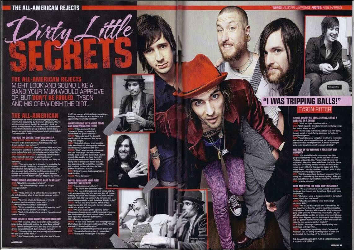
This is my front cover compared to Kerrang magazine.
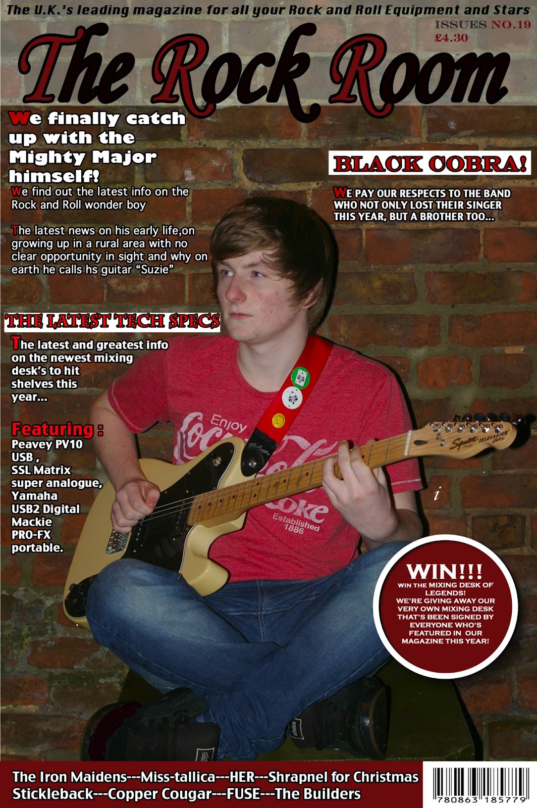
1)  My magazine is less cluttered than most, particularly the right side of Alex’s head. Looking at Kerrang!s cover, we have about the same amount on the front cover, it’s just their picture is alot more prominent and is covering the masthead. Their main article picture is touching the text for their main article. Mine isn’t, which is a convention I broke, but I don’t think I should’ve. 

2) My magazine hasn’t got a very eye-catching masthead, which I would change if I re-did my magazine. I decided to keep the usual convention of having a banner at the bottom of my front page, telling people the bands that would be featured in my magazine. I think the strapline needed to be bigger to catch people’s attention, particularly fans of who the main article would be about, so they’d buy that issue.

3) I have on this page a “pug” about a competition inside my magazine, as this is what my target audience survey wanted in their magazines, competitions. This pug is fairly big and should be able to grab people’s attention.

4) I haven’t really pushed any sort of convention for my magazine, given I didn’t want to make any sort of major error in making it flawed. The things I would change are the brightness of the colours used, and the lighting in my picture. Basically, i would make my front cover page alot more eye catching. 
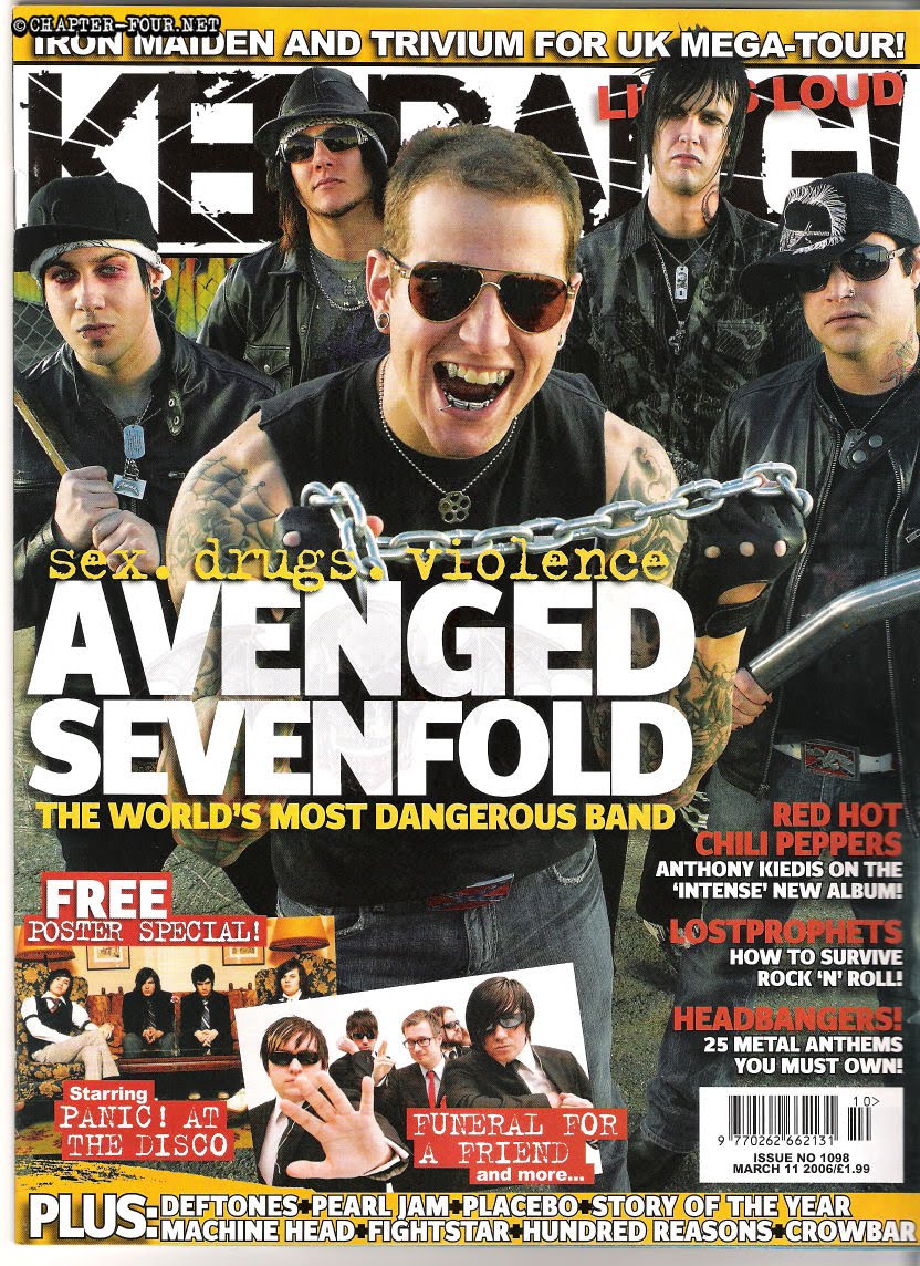


                   Kerrang!


1) Kerrang! Magazine looks very cluttered, but that’s only due to the picture being in the foreground and looking very prominent. They have a similar amount of content being displayed, but they pictures and mine doesn’t. This would be something I would need to change if I re-did my magazine. Side from that, the only major difference is how bright the colours are on Kerrang!. My colours are quite mellow and I would need to brighten them up, instead of being just a dull brown and murky red. 

2) Kerrang!s colour scheme for this issue is a bright yellow. It’s very eye catching and the image on the front is as well. Their strapline is huge, and covers nearly a ¼ of the space of the magazines front cover. It’s in a bold white font that is easy to read from any reasonable distance. They have the banner at the base of their front cover as well, informing people about the bands featured.

3) Kerrang! Don’t have any pugs on their front cover; however they’re advertising the fact that they have posters in their magazine, which is a similar to me advertising a competition. 
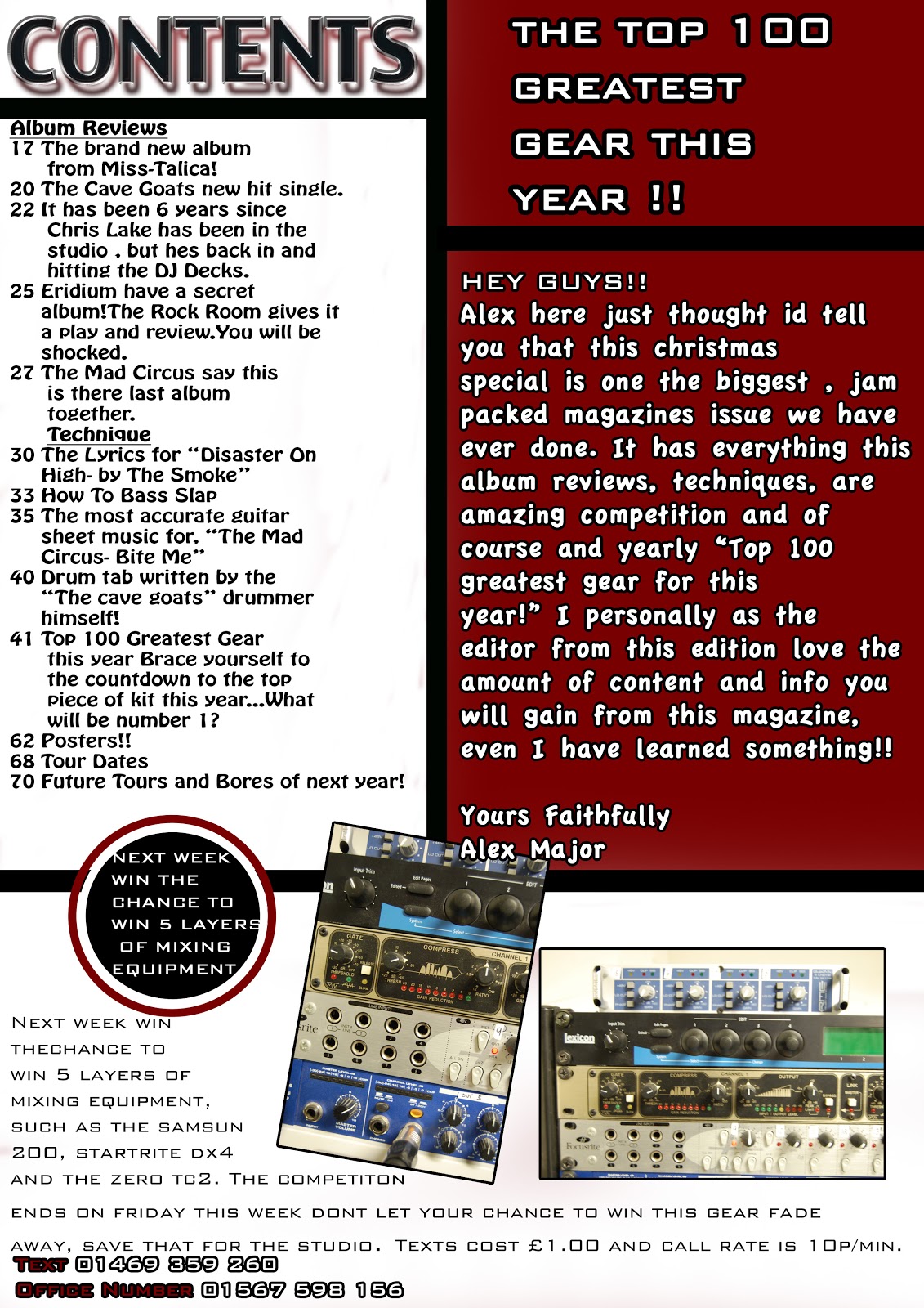


CONTENTS PAGE!
                                                                                         My Magazine!


Here is my comparison between my contents page and a Kerrang! contents page.

1) What my contents page doesn’t have that Kerrang!s does, and is a major difference, is a large picture for their contents page. This would typically be a photo of the headlining article, but I thought I’d be swamping my magazine with all these pictures of Alex. So, that I would say is a convention I broke, and I don’t really think I would change it, but I might change some other things about my page. 

2) The main colour scheme for my page is red, white and black. Kerrang!s is the same, but they don’t really have a dominant colour. My colour scheme is a dominant red with black, white and a little bit of yellow as additions to it. The colours I’ve used are contrasting and do stick out on the background they were put on. The white contrasts with the red and vice verse. The black contrasts with the white and the yellow does so as well with the red. All in all, I believe it to be an effective colour scheme and I wouldn’t change it next time, if I re-did my magazine from scratch.

3) The Competition in my magazine takes up the bottom section of my contents page. It’s a basic competition, simple question and has an appealing prize. The answer for this competition question is located in one of our articles, so it forces the reader to read through our articles, if they want to enter our competition. 


           Kerrang!


1) Kerrang! have a large photo of the band “Green Day” as the main thing on this page. This is to show to the readers what the main article is going to be about and gives them another picture of their idols to look at. It essentially is another selling point.

 2) Kerrang!s colour scheme is evenly balanced no obvious dominating colour. It is all evenly set out, but the background is white, so that would be the dominating colour, if there was one.  None of the colours blend with each other, they all stand out.

3) Kerrang! Have a competition, but theirs is only as a little rectangle in the bottom left hand corner, which doesn’t come across as being very eye-catching.

4) We both have editorial footnotes in our magazine. Mine is there to make my magazine friendlier to our audience, to make it more casual and make our reader feel like I’m speaking to them directly as a person. Kerrang!s I imagine would do the same. 


My Magazine!


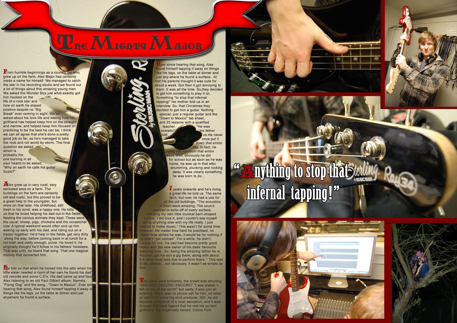
<!--[if !supportLists]-->    1)     <!--[endif]-->A convention that my magazine does conform to is the crossing over the pages, in which an item on the DPS spreads over two pages. For me, this is my title, a part of the banner ventures onto the second page.  
<!--[if !supportLists]-->    


       2)     <!--[endif]-->The next convention that usually is inside music magazines is a montage of photos of the main articles main focus. So in my magazine, the main focus is Alex, so I have a montage of shots of Alex on the reverse side to the article. This layout works pretty well, given that the article is text wrapped around the head of Alex’s bass guitar. 
<!--[if !supportLists]-->3 

      3)     <!--[endif]-->My DPS has a pulled quote on the biggest photo of my photo montage, to show emphasis, and to not cover up any of the other, smaller photos on this page. I wouldn’t change the amount of photo’s in my magazine if i did this again, but I would try mixing the layout up, so i could have a nice mixture of photo and article. 


                                        Kerrang!


1) Kerrang!s DPS does spread over 2 pages a lot more effectively and fluently than mine. It looks as if it’s just been designed on an A3 piece of paper and then just put across the two pages of A4. 
2) Kerrang! conforms to the convention of having a multitude of shots of the main article focus in their DPs. Their layout however, seems to be more chaotic, given they have a large photo of the band in the middle of the page/s and everything else has been ordered around that.
 3)     Kerrang! have a pulled quote that’s touching the main picture. It could possibly be touching the person who said the quote, which is a convention on magazines
 4)     The colour scheme of this DPS works well with the bands’ clothes and logo colour. This is a good technique to use, mainly for the visual effect of having everything match and the fact that it’s visually pleasing to the readers/fans


How does your media product represent particular social groups?

http://www.slideshare.net/JamieCharlesEllis/representations-powerpoint-16471531

What kind of media institution might distribute your media product and why?

http://www.youtube.com/watch?v=ku914gp2U-4&feature=youtu.be

What would be my target audience and how would I attract/address them?

<!--[if !vml]--><!--[endif]--> <!--[if !vml]--><!--[endif]-->We chose an age range we are currently making our way through, late teens and early twenties, because I thought this would give us some insight and we’d be able to make something appealing to this audience. We didn’t find any sort of niche, I’m sure there are some out there, but we decided to go for something we felt comfortable with and felt confident in. To make our magazine a unique one, and not a cheap Kerrang! knock-off, we combined the ideas of musical technology (amps, FX boxes, mixing desks etc.) with your usual rock and roll magazine, like band and artist interviews, latest news in the rock and roll world as well as concert info and plenty of reviews. This gave our magazine the chance to be a very stealthy double threat, appealing to both audiences and satisfying both with ONE magazine. 


(The evidence for these claims are in the contents list for this page)


<!--[if !vml]--><!--[endif]-->Our first step to appealing to our chosen target audience was to try and come up with a name that people liked, that they thought was catchy and one that people simply liked. So, we came up with 4 names and let the public decide. The four choices were “Raindrop Rock”, “The Chord Consumer”, “The Darkest Side” and “The Rock Room” we gave out a survey asking numerous things about our magazine and this was the first question, given its importance. The results we got back ("Darkest Side" with 4 votes, "The Rock Room" with 6 votes, "The Chord Consumer" with 3 votes and "Raindrop Rock" with 3"), so we went with a public favourite for our magazine name. 


 The next stage was to decide upon what our magazine should contain that our audience would like to see. So, naturally, we included this in our questionnaire we sent out. These are the top answers we got back. So, we would include these. The crosswords would be for our older audiences and the posters and freebies will cater nicely to our younger audience. Our results were crosswords 3, posters 8, freebies 5, competitions 1. We were again using our questionnaire to find out what the reader wants in a magazine, so our magazine sells well.


To decide our colour scheme, we again, asked on our questionnaire and the dominant colour that came back was red, so we went with red, black and white as our colour scheme. the problem for us though, was that the red that we chose, turned out to be a dull one, and wasn't very eye-catching. that would be a main thing i would go back and change, so people would notice our magazine from the corner of their eye, and hopefully pick it up and buy it.


To appeal to our TA, we’ve woven colloquial language into our articles, to try and give the impression our magazine is more casual, more friendly toward sour readers. Another way of doing this, was me putting an editors footnote in the contents page. This would give the impression I was talking to the reader directly.

<!--[if !vml]--><!--[endif]-->


Another aspect that our fans like about modern day magazine was the fact that when they have articles on an artist, that the magazine includes many photo’s of the artist in question, so…that is what I did with my article on Alex the Wonder Boy, there’s the article on one page that’s been text-wrapped around a bass head, and there are around 5-6 photo’s of him on the reverse side.  We also included an in depth article/story about Alex to appeal because most fans like to hear about what’s going on in their heroes lives, so by including an article on Alex, we would hopefully have covered another area that fans of this type of magazine like. 


What have you learnt about technologies from the process of constructing this product?

Leveling in Photoshop
http://www.youtube.com/watch?v=cd4hIq6Gmxg
Colour Replacement Tool
http://www.youtube.com/watch?v=E_I9ny7fVy4&feature=youtu.be
Clone Replacement Tool
http://www.youtube.com/watch?v=C6v2Fr3Rots&feature=youtu.be


The camera skills I have learnt include depth of field, ISO, aperture, shutter speed. The depth of field is the area of a photograph that appears in focus. Anything that is not in focus is in a different depth of field.  The ISO is the sensitivity of a camera to light; a high ISO allows the shot to take more in, whereas a smaller ISO delivers crisper shots.  The aperture is a part of the camera that determines how much light enters the camera and at what angle. If the light enters in a small aperture, in a cone shape, then the image will be very focused, as the light rays have been focused onto a specific point.  Shutter speed is how long the camera takes in light for. This, coupled in with aperture, determines the quality and sharpness of photos the camera takes.

Looking back on your preliminary task, what do you feel you have learnt in the progression from it, to the full product?

I started this piece of coursework with no prior knowledge to photography, the key language and technical terms for photography. I had no knowledge of how to use photoshop, no idea about the correct way to use the program, any of the shortcuts used in the program. I was essentially starting the program with no idea how to use it. In my journey through this coursework I’ve learnt how to use the program effectively, how to use cameras effectively, the technical language related to both and I’ve been able to produce some quality work and I’m able to talk about my choices and decisions confidently.


I’ve learned about the codes and conventions of modern magazines and I adapted my magazine style and I’ve been able to apply these skills to my coursework. I’ve learned about the stereotypical layouts of music magazine, which is usually a large photo for the front cover and the other features modelled around that. The contents pages usually have a photo that relates to an important article in their magazine, and they typically have a DPS for their main article which involves photo’s, a large article and usually some pulled quotes will be in this section too. I attended classes that would boost my knowledge in the area of photography, until they were cancelled. I created a research questionnaire for my target audience, which allowed me to find out more about what would make my magazine a success.  If I could do my magazine again, and do things differently, I would definitely try to stick to more of the conventions that I knew were integral to making a magazine a success that I could implement. For example: text touching the article photo, more pulled quotes and I would try to use more photos in my magazine on some of the blanker pages of my magazine.  I would change my colour scheme to a more vibrant
and attractive/eye-catching colour such as a more vivid red, for example cherry red. I would also try to use more media platforms for my questionnaire, such as putting it on Facebook or maybe putting it into a YouTube video somehow.  I would take more photos and perform more photo shoots, so I’d have more choice in terms of what photo’s I wanted to appear in my magazine. I’m happy with the photo’s I have taken and used, but it can’t hurt to have to extra ones.


Monday 21 January 2013

Alex's Evaluation


In what ways does your media product use, develop or challenge forms and conventions of real media products?


How does your media group represent particular social Groups?

http://www.slideshare.net/AlexMajor/how-does-your-media-product-represent-particular-social-groups-16337257


What kind of media institution might distribute your media product and why?


The company I think should publish my magazine is “Future” because Future has a lot of magazines to do with Technology, Entertainment & Video Games, Sport, Music and Creative artistic magazines. They are famous for combining award-winning editorials with outstanding design; I like this aspect of future because a good editorial means that, they care about their audience and costumers. Also they have magazines on music and technology so they have experience in creating the kind of style that they know sells and what doesn’t.  Furthermore Future doesn’t have a magazine like mine, because mine is about rock music, rock artists, improving people’s instrumental skills, musical technology/gear and gig/album reviews. And for this reason, I think that future will be able to reach out to a wide audience from just my magazine, yes future has whole magazines on just technology and music but mine will be able to bundle these two together and appeal to a bigger audience across just one magazine pleasing more of the majority of futures audience but my magazine is age ranged to 16 to 22.

Who would be the audience for your media product/How did you attract/address your audience?


The target audience for my product is 16-22 year olds and is aimed at 60% towards boys and 40% towards girls because my magazine has a large amount of technical language about instruments and musical equipment. And because most artists that use a lot of this equipment are male dominated I make it more appealing for the male audience but not too much so that I put the girls off the magazine, which is why I kept the colour scheme simple and with no stereotypical colour like a lot of pink or blue, I chose red to be my main colour that way it applies to both sexes. The reason why I have chosen the age range 16 to 22 is, because the 16-year-old girls will buy the magazine mostly for the big band articles and also the images of rock stars and the way they look. Whereas at the other end of the scale the 22 year old males will be mostly interested in the music equipment such as DJ equipment  and mixing decks etc. but that does not mean that either age or sex doesn’t look at the others main interest either because they do. Another reason I chose this age range is because that the age range has the biggest population of people that listen to rock and heavy rock music that also are interested in making their own music. Another way I address my audience is through the magazine through things such as competitions and physically asking the audience to contact the writers and tell them what they want in the next issue or to vote in on a poll to settle a score on something to see what the better product/song/album was.

What have you learnt about technologies from the process of constructing this product?

http://www.slideshare.net/AlexMajor/what-i-have-learnt-about-technologies-from-the-process-of-constructing-my-product-17017327


Looking back on your preliminary task, what do you feel you have learnt in the progression from it to the full product?


At the start of the course we made a magazine for six formers, about future education, revision help etc my magazine had prom pictures as the big article. For this I went to my girlfriends garden and took pictures of her in her prom dress and used the best one for the front, as for conventions on my magazine I only included a masthead, a main cover line/selling line and two pugs/puffs. Also all of the fonts and the house style isn’t creative, it doesn’t look very good, it’s boring to look at, there isn’t a lot going on in it and last but not least it doesn’t look professional it just looks like a picture with words on it, it doesn’t look like a magazine font cover.


Whereas my front cover for my product is very different to the prelim task because it has a lot more conventions of a magazine on it such as a slogan, barcode, captions, banner, competitions, issue number, price, colour scheme and a house style. Also my front cover actually looks more like a magazine front cover because it looks more professional, it doesn’t look like a picture with words on it. That’s one of biggest things I’ve learnt from the prelim task, I used to look at my prelim task a lot when I was making to see what I did wrong on it so I avoided it on my real cover. When I was using the prelim cover to help me make my real cover I used it to help with the structure and layout of it a lot because I didn’t do that brilliantly on my prelim either.


Another thing I have progressed and learned from my prelim was my photography skills even from my good photos I evaluated I still don’t think there that good apart from the photo I used on my prelim cover because I like the mise en scene on it, but looking back on them they all just look a bit rubbish, a bit amateur it’s like I didn’t really know what I was doing I just turned the camera on and took some photos. But when it came to my real photos I thought about how bad my photos were and I learned about ISO, shutter speed and aperture in hope that they would look better and I personally think all of my photos throughout my magazine aren’t bad the only problem is the front cover and that my sisters eyes aren’t looking straight at the camera because that breaks a code in music magazines but the reason I did that is because I wanted it to look as if she knew she was in trouble and that she was looking to see if someone is looking for her. And that photo proves how much I’ve learnt about photos because when I took my first ones I didn’t even think about what or where I was taking them, I actually thought about what I wanted every little bit in the photo to look like and what lighting it needed.


Wednesday 5 December 2012

Alex's Selection and Rejection Of Photos


Rejection 1

The first photo I am rejecting was meant to be for my front cover but for this photo is to dark and slightly blurred. Another thing is that there is hardly anything in the background this photo was the decider that I needed to push a lot more props into the photo. Also its just not a great photo and I personally just don’t like the photo very much.


Rejection 2

This photo is another photo, which was going to be for my front cover I changed the actor, the type of shot and the background a little. But the photo is blurred ever so slightly so when it’s zoomed or stretched a little bit it is pixelated and cannot be used for the magazine.


Rejection 3

I rejected this photo because the photo is very dark, flash wasn’t on for this photo because the previous one we took the guitar in the middle reflected the flash, so we tried it without and it turned out to dark.


Selection 1

I used this photo for the front cover because I personal thought it was the best photo out of all of the ones we took, also it was the closet one to what I had pictured in my mind. And it had enough space to write things on top of it so it was perfect for the front cover.


Alex's organisation of actors, props and photo shoot plan


Photo shoot 1
The first photo shoot i did was certianly one of the hardest shoots i did , not because of the sheer amount of props i had to use which was 8 guitars, 4 amps, 2 effects boxes, 1 keyboard, 4 guitar leads and alot of tinsel and christmas decorations these were needed because my magazine is a christmas special. I used 2 actors for this shoot Celine Pohl and Frances Major in the end i used the photo which had France in because it looked more what i wanted it to look like. This shoot was taken in my house in the living and all of the props we brought from my room into the lounge.

Photo shoot 2
The second photo shoot i did was in the recording studio and because my jamie's magazine is based on rock music and the technology side of music i needed some pictures of the mixing desk and instrutments i dont have at home such as drums. For this shoot no actors or props were needed, no actors were needed because i only needed pictures of the equipment and no props were needed because they were already in the recording studio.

Photo shoot 3
The last photo shoot was like the second one because most of the photos were blurred because there was a smudge on the lense so i had to basically take most of them again but from this shoot i came up with better angles, making some of the orignial pictures better then they were. And i also took more variety of shots such as close up and midshots.

Alex's Draft Pages

This is my front cover draft.


This is my contents page draft.


This is my double page spread draft.


Monday 3 December 2012

Alex's Front Cover


Jamie's Final Front Page

Here is my final picture for my front cover. i think it has worked very well. the banner looks very good with the translucent effect and the final looks very much like my draft did.

Jamie DPS Text


The Mighty Major!

From humble beginnings as a country lad who grew up on the farm, Alex Major has certainly made a name for himself. We managed to catch the star in his recording studio and we found out a lot of things about this amazing young man. We asked the Wonder Boy just what exactly got him hooked on the life of a rock star and how on earth he stayed positive despite no “Big Break” ever coming in sight. We’ve asked about his love life and seeing how his girlfriend has helped keep him on the straight and narrow, and helped keep him focused on practicing to be the best he can be. I think we can all agree that she’s done a pretty good job so far, as he’s managed to take the rock and roll world by storm. The final question we asked, which is probably the one burning in all your hearts to be asked, “Why on earth he calls his guitar Suzie?”

Alex grew up in very rural, very secluded area on a farm. The buildings on the farm are certainly old and rustic, but this proved to be a great help to the youngster, but more on that later. His childhood, still fresh in his mind, was a happy one. He tells us that he loved helping his dad out in the fields, feeding the various animals they kept. These were the usual; sheep, pigs, chickens and the occasional cow. A typical weekend would often end up him waking up early with his dad, and riding out on a tractor together. He’d help in the fields, get very dirty along the way, before coming back in at lunch for a hot bath and oddly enough, pizza. He loved it; he originally thought he’d follow in his fathers’ footsteps. That was until, he heard that song. That one magical melody that converted him.


He told us that when he moved into the attic when his little sister needed a room of her own he found his dad’s old records and some C.D’s. His dad came up and found Alex listening to an old Paul Gilbert album. Namely, “Flying Dog” and the song...“Down to Mexico”. Ever since hearing that song, Alex found himself tapping it away on things like his legs, on the table at dinner and just anywhere he found a surface. At first his parents thought it was cute for about a week. But then it got annoying to them. It was all the time. So, they decided to get him something to play it on. Something “to stop that infernal tapping!” his mother told us in an interview. So, that Christmas they decided to get him a guitar. Nothing special, just a regular guitar and the “Down to Mexico” tab sheet, and 25 lessons with a qualified teacher. “He was ecstatic!” his father told us. He never once put it down that entire day. In fact, he rarely left his room that entire week. Well, obviously he did for school, but as soon as he was home, he was up in that attic strumming, plucking and rocking away. It was clearly something he was born to do...
7 years onwards and he’s living a great life he told us. The same farm, but now, he had a use for all the old buildings. “The acoustics in them were amazing. The sound seemed to echo off of every surface, creating my own little musical barn-shaped bubble. I did love it, and I couldn’t see myself doing anything else with my life really. I just wanted to make music.” This wasn’t for some time however. No matter how hard he practised, no matter how skilled he was, it would be for nothing if he didn’t “get noticed”. For a while, he didn’t. Luckily for him, his dad had become pretty good mates with the new owner of his dads’ favourite watering hole.  So, being the amazing father he is, Reuben, got his son a gig there, along with about 8-9 other local acts due to perform there. “ This was it! My chance... but obviously, it wasn’t as simple as that”...

The show went brilliantly; the crowd was shouting “ENCORE! ENCORE! ENCORE!” “I was elated, I felt on top of the world!” but sadly, it was just an evening. There was no phone call for him, no letter or visit from some big-shot producer. Still, he did become somewhat of a local sensation, and it was through this local legend that he met his current girlfriend, the angelically voiced, Celine Pohl.

Saturday 1 December 2012

Institutions Research


The first institution I’m researching is IPC Media. They claim to be the leader of UK engineering, technology, country lifestyle activities. They have currently 42% of men in the UK buying at least one of their magazines and about 2/3 of women populating are buying at least one of their magazines.
The only music magazine they sell, which would compete with ours, is NME. NME appears to be a magazine that doesn’t focus on a specific genre and they also contain other news, such as sports. This could both be a bad and a good point. It’s bad, because it means we’d have to contend with them, but it’s a good point, because it means the company has faith in a magazine that has multiple focuses. This would be ideal in a way, because it means we’d have a chance at getting noticed, because they know themselves how popular a magazine like this can get.

Future PLC.
The next institution is Future PLC. They claim to be “the biggest guitar and music-making publisher in the UK” which would be a great reason to go to them. This is obvious why; they clearly know what they’re talking about when it comes to selling music magazines and editing them.  They produce “Classic Rock” and “Metal Hammer”.  This tells me that they are trying to go for magazines that confer to the “master of one” way of thinking, rather than trying to be “jack of all trades”, so they wouldn’t have much faith in a magazine that is trying to focus on new artist’s and new musical technology devices.
Plus, Future has a technology section of magazines as well, so that makes me think they wouldn’t want a magazine that bridges the gap. They’d probably suggest to us to split the magazine into two separate ones. This would mean we’d still get business, but not through our magazine.


Imagine Publishing
Imagine would only really cater to the technology side of our magazine, so I doubt they would accept our magazine and it would only be to focus on the musical technology side.

Bauer Publishing
Bauer is now the largest consumer magazine publishing company in the UK, playing a primary role in the Women’s Weeklies, Women’s Interest, Women’s Lifestyle, TV Listings, Puzzles, Men’s Lifestyle, Music & Film and Specialist magazine markets.
Bauer is obviously one of, if not the biggest publisher around, so it’s natural we’d donsider them. They have many music magazines in production right now, and our biggest rival among these would be Kerrang! They are probably our magazine’s most trying rival, given how big their fanbase is, and the fact that they cover many types of stories. We would outmatch them on the technology side of our magazine, but they would beat us with the music, just because of their substantial notoriety in the music magazine field, and it’s due to Kerrang!s success that Bauer are unlikely to publish us, because they are already publishing Kerrang!